


PowerPoint's structure and the ease of adding content to slides prompts special accessibility considerations. The best way to make an accessible PowerPoint is to keep these in mind as you are first creating the document, as it is common to have to recreate slides otherwise. This page details the PowerPoint-specific accessibility concerns. Be sure to review the issues listed on the Microsoft Office page as well.
Color Contrast
This was mentioned on the general Office page, but given PowerPoints generally use more color than Word documents, it's worth repeating here. Be sure to keep sufficient contrast between the text and the background. Consider also the experience of a colorblind viewer; avoid differentiating only by color. Use tools like contrastchecker.com and the Accessibility Color Palet Builder to check that the colors are not interfering with the readability of the presentation.
Reading Order
Reading order concerns how content is read to a screen reader. To see the current reading order, you can open the selection pane. The elements in the selection pane will read from bottom to top. Click through these in order and rearrange any that are out of place with what you expect the logical reading order to be.
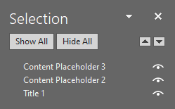
There are a couple important practices to keep in mind when considering the reading order of your slides.
Use Content Blocks
Content blocks are the multi-purpose placeholders that are present when you open a slide layout like Title and Content or Two Content. Almost every element you add to a slide should be added inside a content block. The main exceptions to this are titles and page numbers.
If you enter text elsewhere on the slide (yes, even in a text box), it may not be read by a screen reader as it exists on a different layer than content blocks. You can see this structure if you add text in both a content block and a text box to a slide and then open the Outline View in the View tab. The text will not appear in the Outline View, demonstrating that it is not properly in the reading order.
This is why content blocks are essential. Using content blocks for both textual and visual elements will ensure that they are all properly situated in the slide's reading order. However, a couple difficulties pop up when trying to follow this practice, namely not having enough content blocks and creating diagrams or visual difference with the in-built shape tools.
Adding content blocks
A good way to add more content blocks to a slide is to create a new layout with at least the number of blocks you need. This can be done with the Slide Master.
- Open the Slide Master (View > Slide Master)
- Right click on one of the layouts that contains a content block and choose Duplicate Layout. Two Content is usually a good starting point. If you like, you can right click this new slide and rename it to something more helpful like Three Content or Many Content.
- Select this slide, and click on the border of one of the content blocks. You can now copy-paste or Ctrl + drag the content block until you have your desired number of blocks.
- Rearrange the elements on the slide to your liking.
- Exit the Slide Master and use your new layout.
Use of the shape tools
You may want to create a diagram with shapes. This is fine to do, but instead of keeping everything on the slide as independent elements that all need alt text, you should select all of the elements, right click and Save as picture, and replace the diagram with the image you just saved as the diagram. This way you can alt text the diagram as a whole, insert it into a content block, and keep your reading order clean and orderly. SmartArt should be managed the same way, as it has the same issue that text boxes do.
Another common use of shapes and text boxes is to create a visual distinction from other text on the page. Because this can lead to your text not being present in the reading order, it's better to use content blocks and modify them to change the shape, outline, fill, and other effects. Simply select the block you'd like to edit and navigate to the contextual Format tab. The Edit Shape dropdown on the left side of the ribbon can be used to change what shape the content block takes, and they can be edited like other shapes. You can also use the Shape Styles section of the ribbon to adjust the coloring or effects, and many of these options can also be found in the Format Shape sidebar, which can be found by right clicking on the content block or clicking one of the popout icons on the Format tab. This sidebar also contains other useful tools like the ability to adjust the margins for text.
Visual Relationships
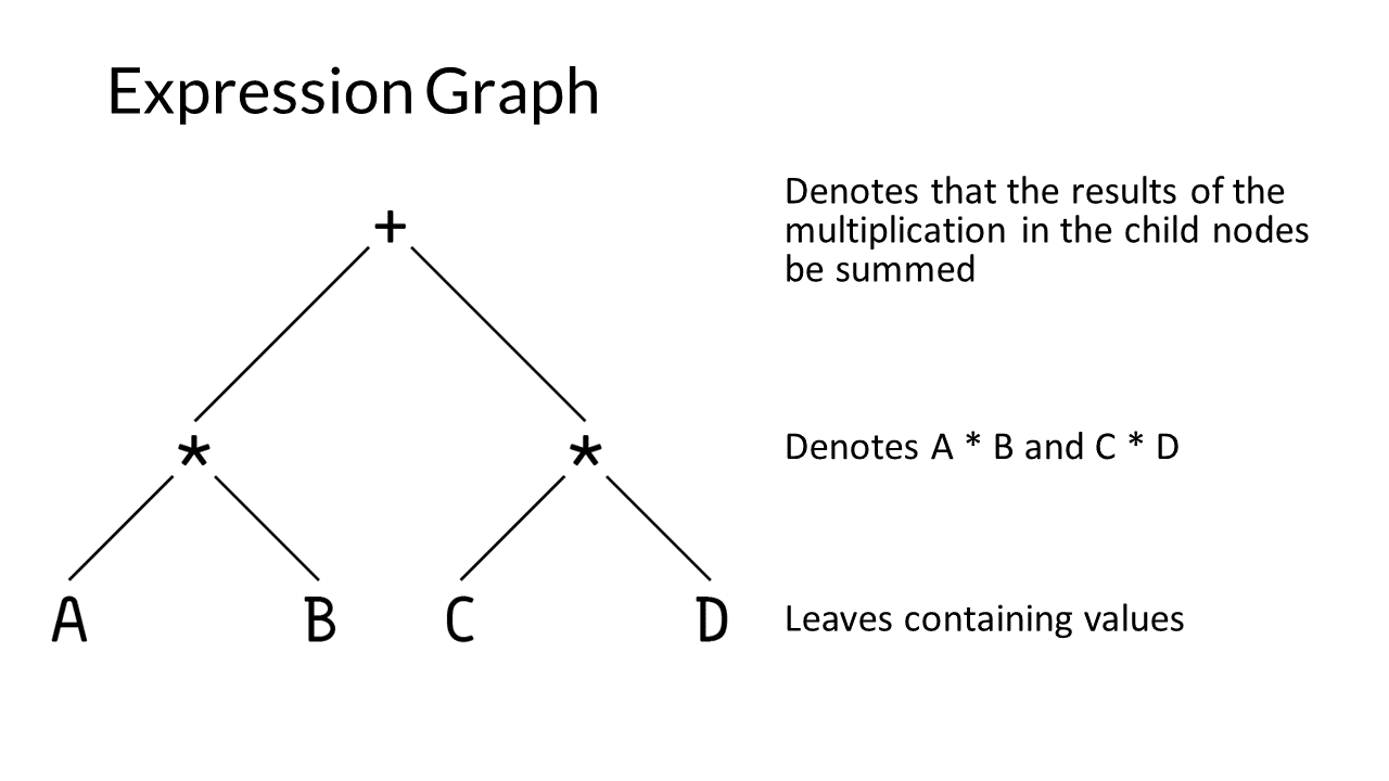
Something that may be overlooked in considering reading order is the presence of relationships that are implied visually but are not reflected structurally. For example, the slide below contains one image and three text blocks labeled with the order in which they will read. Notice how each piece of text is implied to refer to part of the image, but the image is read as a single unit. A blind user won't be able to understand the relationship between the image and the text as easily as a sighted user, and so either the slide should be edited to label the text with its referent or the image should broken into three so that each may read before its respective text.
Slide Titles
Slide titles function like headings in a text document, providing a navigational structure to screen reader users and a meaningful way to refer to a specific slide in contexts like discussion board posts or just in conversation while studying. As such, every slide must have a unique title that describes its contents. If a topic spans multiple pages, you may include a (cont.) or (pt 2) label, though it may be more helpful to consider how you're breaking down that topic and provide more specific titles.
Animations and Transitions
Animations and transitions can be problematic in a couple of ways, but there can be accessible implementations of them.
The most obvious issue with animations is when they function to present information. Here it may be possible to provide alt text such that each animated element describes its function in the animation. However, if the animation is complicated enough, this could either lead to a cluttered and confusing reading order or, if elements move more than once, not being able to cohesively describe the animation. In this case, it may be necessary to either simplify your animation, split it across multiple slides, or consider a different way of conveying the information.
For any animation, the main goal should be to reduce the number of elements on the slide as much as possible to simplify the reading order. If you have static elements, combine them all into a single image. If you're just animating text, place it in one content block and use the animation settings to have the animation affect each bullet individually.
Slide transitions and animations used for visual effect rather than instruction should be used judiciously as they can be distracting if they are too numerous, lengthy, or flashy. If you plan to use transitions and animations like entrance and exit effects, keep them short and simple. Consider changing the animation settings for a content block to affect the whole block rather than the individual bullets.