


The accessible syllabus template is a vital resource to provide an accessible starting point for your course syllabi. However, the accessibility of these documents relies on it being considered at every revision. It is not sufficient to build your syllabus from the template and assume that the resulting document is accessible.
This page will detail the most important things to keep in mind when editing an accessible Word document, particularly when working with the accessible syllabus template.
Consider How Assistive Technology Reads
Assistive technology, such as a screen reader or braille display, has to present a navigable version of the document purely through speech or text. At its most basic, it is simply the computer reading the document to you. In such a format, purely visual information is not conveyed unless it is styled correctly, so elements like headings and images would be just normal text or "image", respectively, without a heading style or alternate text. On the other hand, structures like tables and lists imply specific semantic relationships, and using them improperly or using visually similar formatting without using the relevant structure can cause confusion and lead to the content not being effectively communicated.
As you edit your syllabus, be sure to think about how someone unable to see your document would interact with it and how the way the content is formatted affects their experience.
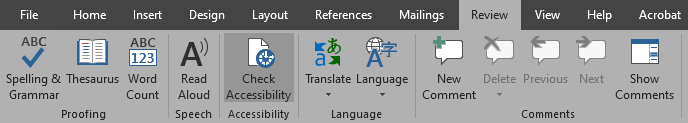
Use the accessibility checker
The accessibility checker will run an automated check on your document and report common accessibility issues. It can be found under Review > Check Accessibility or File > Check for Issues > Check Accessibility. You can click on an issue to see its location in the document and an explanation of why the issue is important and how to fix it. However, it is important to recognize that the checker is not comprehensive, and it will not flag some of the accessibility considerations discussed below.
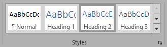
Style New Headings
Headings are an important part of document structure. Similar to how a sighted reader could use them to quickly find a specific section and start reading from there, assistive technology uses them to speed up navigation in the same way. However, it only knows if something is a heading if it's styled as one. All of the headings in the accessible syllabus template are already styled for you, but if you add new headings, be sure to apply the correct style. You can see the navigational structure created by the headings with View > Navigation Pane.
Don't Copy-Paste Tables
Assistive technology expects that tables have a consistent number of cells in each row and column, and that each column has a header that labels its contents. It's common to merge cells or to ignore the header row if tables aren't designed with accessibility in mind. Thus, copy-pasting tables from another document is discouraged in favor of using the tables provided in the template because they are already structured in an accessible manner. If you need extra rows or columns for your content to fit, those can be added to the existing tables.
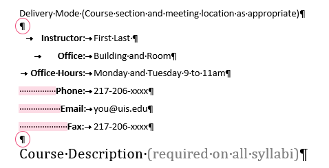
This rule also applies to tables used for formatting, like for instructor information. This should always be avoided because tables are designed to convey tabular data and not formatting. Thus, the instructor information section of the template is structured with tab stops to ensure clean reading. Replace the placeholder information with your information rather than copy-pasting from an old syllabus.
Avoid Extra Whitespace
Multiple consecutive whitespace characters like spaces and tabs, as well as empty paragraphs, can get read as "blank" by a screen reader. Also, if you add an empty paragraph by pressing enter in front of a heading, that empty paragraph will also be styled as a heading and be included in the document structure. Therefore, it's important to show formatting marks (Ctrl + Shift + 8) to find these and remove them. They can then be replaced by other formatting options. Make use of the ruler to change indentation or add tab stops for horizontal spacing, and use the spacing options in the Layout tab or page breaks for vertical spacing. For more detailed information on these formatting options, see the section on whitespace characters.
Ensure Proper Link Formatting
If links are provided as raw URLs, assistive technology users can have a difficult time understanding the destinations they direct to. This is especially relevant because they can request the AT to read out all of the links in the document, which removes them from any context that may be helpful. Thus, hyperlinks should always be given a descriptive title that describes their destination, even if the link is read by itself. If you'll be printing your syllabus, include the raw URLs of any new links you add on the last page without having it as an active link.
Use Strong Style for Emphasis
If you're using bolded, underlined, italicized, or colored text for emphasis, that does not get conveyed to assistive technology by default. To ensure that the text is read as emphasized, it should be styled as Strong. While this defaults to just bold, any formatting can be reapplied afterwards without losing the semantic information. However, keep in mind that this can only convey a single type of emphasis, so if there is a relevant distinction between how italicized vs bold text is used, for example, this distinction can't be meaningfully conveyed to an assistive technology user.