


Beyond what is mentioned in the Accessible Office page, Word has a few additional accessibility concerns you should be aware of. Also included on this page are some useful formatting tools in Word to deal with these issues as well as how to use the accessibility checker.
How to Check Accessibility
Word has a built in accessibility checker located under Review > Check Accessibility or File > Info > Check for Issues > Check Accessibility. This utility will provide a list of most accessibility issues in the document. If you click on one, it will show its location and provide a brief description of why the issue is important and how to fix it.
Not all accessibility issues will appear in the checker, and the issues are not consistent across different versions of Word. In particular, the structural aspects detailed below, color contrast, and natural language hyperlink text may not be mentioned. It's important to be aware of these so you can identify any related issues and remedy them when they occur.
Styles
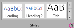
Word uses styles for ease of formatting as well as to denote certain semantic information. The most important of these for accessibility are the Heading styles and Strong.
Headings
Headings provide an important mode of navigation in a Word document. You can see this navigational structure if you show the Navigation Pane by clicking the checkbox on the View tab. The title of your document should be a Heading 1 style (of which there should be only one), the major headings Heading 2, and so on. You should never skip headings as you move lower in the hierarchy, but you may do so in the other direction. Examples of both proper and improper heading structures are below:
Proper heading structure
- Heading 1
- Heading 2
- Heading 2
- Heading 3
- Heading 4
- Heading 3
- Heading 4
- Heading 4
- Heading 3
- Heading 2
Improper heading structure
- Heading 1
- Heading 2
- Heading 4
- Heading 2
- Heading 3
- Heading 2
- Heading 1
- Heading 3
- Heading 4
- Heading 2
- Heading 3
Strong
When you want to show emphasis in a document, you may use bold, italics, or underlines, but these are only visual indicators. To ensure that your emphasis is conveyed to screen reader users, you need to apply the Strong style. You can edit this style to work for multiple different visual emphases using the styles pane.
The Styles Pane
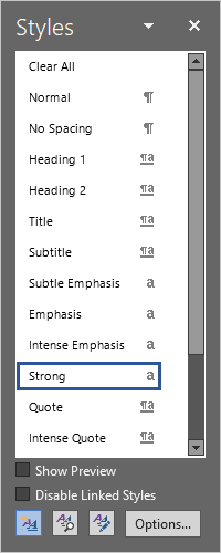
In many cases, the default styles in Word do not match with the formatting of the elements you need to style as headings or Strong. Say you have a document that has visual headings but not ones that have heading styles applied. You can highlight one of your headings, right click on the appropriate style in the styles pane, and choose "Change [style] to match selection". This will apply the formatting of your selection to that style and apply the style to your selection.
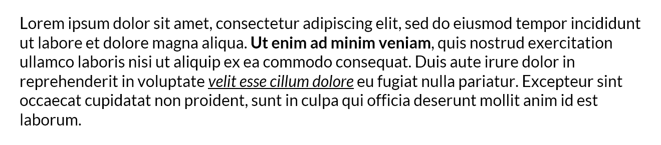
It's worth noting that this will change every other instance of that style in your document. This may not be ideal if you use different types of emphasis formatting that all needs to be styled as Strong. Take this example. Here there is some lorem ipsum text with two emphasized portions. The first has the Strong style applied to it, but if we were to apply the Strong style to the second emphasized portion that is italicized and underlined, the formatting would be overridden.
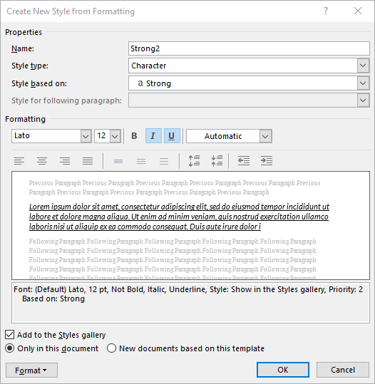
Of course, you could apply the style and manually change the formatting back to match the original, but in the case that these styles are used throughout a longer document, you may want to create a modified copy of the Strong style. To do this, open the styles pane by clicking the popout icon under the styles gallery. Then, click the New Style button on the bottom left. This will bring up a dialog box to define your new style. Give it a name and set Style type to Character and Style based on to Strong. Then apply any formatting you'd like it to have and click OK. You can then use this style in your document to provide the same emphasis with different formatting.
Whitespace
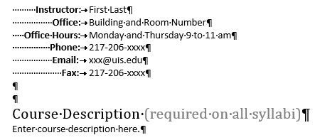
Another thing you want to watch out for is repeated whitespace characters, especially empty paragraphs. These may be read as "blank" by a screen reader, and can even be mistakenly styled as headings in your document, clogging up the navigation.
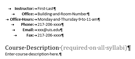
Luckily, Word has a multitude of formatting options for both vertical and horizontal whitespace that can help reduce these excess characters, as well as the utility to show formatting marks by clicking the paragraph symbol on the home tab or by pressing Ctrl + Shift + 8. If you're in a table, you can also make use of the alignment options in the contextual Table Layout tab to control where your content sits in the cell.
Horizontal Whitespace
The ruler is your best friend for managing horizontal spacing in your document. If it's not visible, you can show it by clicking the checkbox on the View tab.
On either side are the indentation markers, which allow you to control the amount of space to the left and right of your text. The left marker is also split to allow you to control the first line and hanging indent separately.
The ruler also allows you to control the amount of space a tab takes up. You can click anywhere on the ruler to create a tab stop. Once it's in place, you can drag it around to adjust the spacing, and double clicking will open a menu with more tab options like adding leader lines or changing the type of tab stop. You can also cycle the type of next tab stop that will be added with the button above the vertical ruler. To remove a tab stop, simply click and drag it off the ruler.
-

The left tab stop is the default, and aligns the left side of the text after the tab to the tab stop.
-

A center tab stop will center the text after the tab on the location of the tab stop.
-

The right tab stop aligns the right edge of the text after the tab to the tab stop.
-

The decimal tab stop is made for aligning numbers with a decimal point such that the decimal point is aligned with the tab stop.
-

The bar tab stop inserts a visual vertical bar at the location of the tab stop. Because it isn't inline, it likely won't be read by a screen reader, so use this only when the visual information it adds is not necessary for comprehension.
Vertical Whitespace
For adding space vertically, there are a couple options depending on your intent, the first of which is adding a page break (Ctrl + Enter) rather than using many empty paragraphs.
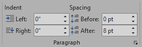
For adding space between two paragraphs, you can utilize the spacing options in the Paragraph section of the Layout tab.